
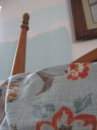
The driving intention for this week has been this earth shattering decision.... what shade of blue to paint the bedroom?
I've had a multitude of paint sample strips pinned to the walls for the last several months. With the holiday paint sales this week, it's time to make a color choice! What will be the background of my room for the next decade? Something soothing, something refreshing, yet not insipid as though there was a fear of commitment to color.

I've played with changing (back)grounds in my creative work too. Jude at spiritcloth noted my play with Pitt pen on fabric. (And Hello to those who've clicked through from her link!) I was fascinated with how the same mark maker and hand motions could create such a different feeling to the motif just due to the grounds. (Above the difference between pen on paper and pen on cotton fabric.)
And the big decision on color? The lower swatch, the bolder "Jetstream" color!
When we first moved in, we've only been in our house for less than a year still, I wanted to paint. I used different colors for every room and in most rooms two and three colors. Our blue and brown bedroom is very peaceful. I like the lower color too and your pillowcase is just lovely!
ReplyDeletePen on fabric looks like fun! I like the softer look it lends to pen and ink. Any tips you've learned so far?
Jackie, I too have had a fear of colour commitment. My living room and dining/computer room are now yellow. However, the first colour to be put on the living room (after two coats) was too much of a lemon yellow and so it got primed and re-painted. The colour now is not that much different but it would have bothered me to leave it. After all this I heard that you should get one shade lighter than the swatch as paint dries darker.
ReplyDeleteYour bottom colour is much better.
drawing on fabric is really different. i have had to adjust my expectations... i love those sort of dot things you have drawn.
ReplyDeleteThe pen on fabric is wonderful, very organic looking as opposed to the more clinical look of the paper---interesting experiment to try!
ReplyDelete